The Difference Between Misleading Banners and Non-Misleading Banners

 11 min read

You are currently in the "Banner" - Learning paths

1
banner design for ads
Banner Design for Affiliate Marketing: The Definitive Guide

10 min read

2
mobile ad formats and sizes
Best Mobile Ad Formats and Sizes: Essential Guide

12 min read

3
call to action
What is a Call-to-Action and Why Do You Need One?

9 min read

4
improve campaign performance
Banners: Tips To Improve Campaign Performance

5 min read

5
banner copy in different languages
How to Write Banner Ad Copy in Different Languages

13 min read

6
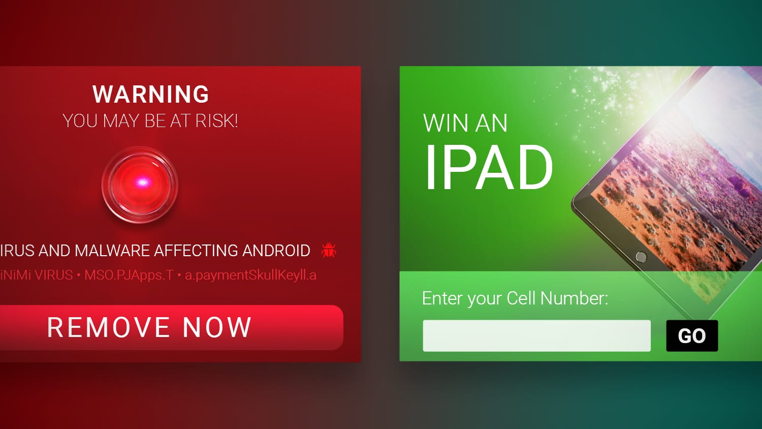
The Difference Between Misleading Banners and Non-Misleading Banners

11 min read

7
ctr in cpm campaigns
5 Aspects About CTR You Should Know for CPM Campaigns

4 min read

Advertisement

Introduction

Our Academy is growing incredibly fast. In these first years of this remarkable affiliate marketing educational platform, you’ve been able to learn a whole lotta cool things!

Even so, it’s only just beginning! Indeed, there’s still much to learn!

In previous posts, you’ve learned about the most popular and common pre-landers.

You’ve also been able to understand some important facts about banner optimization which helped you improve your campaign’s performance!

Today, we’re gonna talk about a different aspect.

We shall let you learn something new about the banner itself.

More specifically, we’ll refer to the wrong usage of banners and some of those toxic and misleading advertising techniques you should get to know as soon as possible!

What’s a banner?

A banner is a powerful tool and one of the most efficient ways to generate sales and achieve success in the affiliate marketing world.

It communicates an advertiser’s message to a user. It’s a graphic image (with or without text), that’s used as an ad with the main goal of attracting as many users as possible.

Whether you’re a Social Media Marketer, Webmaster or a Media Buyer, you can choose to promote your offers using banners.

These images are a crucial aspect of the business, since they can directly affect the performance of your campaign. Even so, they tend to be neglected by most publishers.

Beware: underestimating the power of a well-crafted banner is a huge mistake!

If you have amazing design skills, you can create your own banners.

You don’t have those saucy skills?

No biggie!

Just use one of the millions of banners available online.

In any case, you should be careful and make sure you always use a quality product and a traffic source that’s compliant with the carrier, advertiser, affiliate network and the ad network/DSP’s promotional rules.

It’s important to understand how to use banners, and which ones you’ll do best NOT to use at all.

Why?

Because it’s the first interaction with a user as a potential customer.

This means that the banner you work with is the face of your company/product.

The problem is that people often choose the easiest method and prefer using wrongful and untrustworthy ways to achieve success.

That’s how misleading banners enter the picture. It’s always better to make 20k in the long run than 5k tomorrow and then be mercilessly blocked.

Misleading Banners: the beginning

Quite often, misleading ads appear while you’re surfing the internet.

You see them all the time, whether you realize it or not.

Most users out there just seem to ignore the ads, which forces publishers to use all the textbook-tricky methods to get their attention.

But what’s a misleading banner?

Don’t worry!

We’re gonna provide all the tips you’re gonna need to be able to detect it.

Once you know what to look for, you’ll be able to spot it by yourself, even without having to look any further than the banner’s image.

Let’s start with the basics!

What’s misleading advertising?

Misleading advertising is giving the wrong idea or impression about the content of the offer by using deceptive banners to promote it.

Your job as a publisher is to promote using efficient and honest banners. Our advice for you would be to use the most authentic call to action as possible.

In fact, go for expressions such as “Click here”, “Download now” and “Subscribe here”.

These work wonders since they engage customers to click your banner and can help you increase your CTR to boot!

When working with affiliate networks, it’s important to understand their rules and restrictions, specifically when it comes to the use of banners.

Networks and advertisers are constantly checking and monitoring the quality of the traffic they receive, since quality is key in this industry!

Quality traffic equals low churn rates and super happy advertisers.

However, advertisers are aware of how difficult it can be.

That’s why they usually compensate the good work with an extra motivation.

Which one?

An awesome increase in payout!

Why is it important for you to know what misleading advertising is all about?

Firstly, to save you time, money, and to calm your sensitive nerves.

Knowing what networks and advertisers don’t wanna see can save you time and lots of money (trust us on this, bro!)

Secondly, misleading banners don’t live for long and won’t ever bring quality traffic.

People clicking a misleading banner will soon realize the content of the offer isn’t the same as what’s being advertised.

What happens, then?

They won’t convert! This means there’ll be 0 leads generated.

If you wanna have that super cool maximum efficiency, you’ll need to create/use banners that are appealing to your traffic and, most importantly, compliant with the landing page.

The offer’s content should always match the content of the banner and LP you’ll use.

That means you’re being as efficient as possible, optimizing like a professional!

What’s gonna happen if the content doesn’t match the banners?

Advertisers, traffic, and affiliate networks are gonna complain, set a fine, or even get you banned.

Having multiple visits but no conversions on your offer is a clear sign of a low-performing banner.

If this happens, you should test other banners until you get that perfect match between visits and sign ups.

Related Content: Banners – Tips to Improve Campaign Performance

Don’t forget: affiliate marketing is a trial and error game! There’s no magic recipe or formula for success!

Once you test different banners and find the one that best fits the content you’re promoting to your traffic, people will click it and be automatically redirected to the offer page, so they can subscribe and conclude the flow process.

It’s also important to use pre-landers so that you can narrow your audience, and get that highly precise, mega targeted traffic.

By using pre-landers, you’re gonna be scaling up your campaign and focusing on getting only the attention of people that are really interested in the service.

We promise these posts are gonna help you get the basics right!

Related Content: Pre-Landing Pages: Main Web Concepts Explained

No sketchy schemes nor multiple redirections. What you see is what you get!

What are misleading banners?

To make sure we’re on the same page, let’s see them one by one.

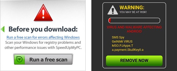
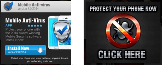
1. Antivirus banners with virus alerts

Check this example:

Bad use of banners

banner 1

Good use of banners

banner 2

Black background, and red letters, with an Alert sign?

What could be more “appealing” to force a user to download/subscribe?

The thing is that you, as a publisher, can’t really detect whether or not there’s a virus on your device.

That’s why the banner can’t state that the device is in danger.

More than that, many antivirus pop-ups will appear, the phone will start vibrating, the user panics and clicks on all confirmation buttons available.

Now imagine that, besides all this, the users are unable to leave the page.

They can’t even close the ad!

Trust us:

This sort of shenanigans is gonna get you in trouble with both the affiliate and traffic network!

This is unfair and dishonest to your users which obviously won’t become leads after all.

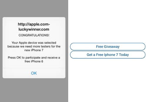
2. Congratulations! You’ve won!

Remember 3 strictly forbidden sentences: “Free”, “Congratulations”, and “You’ve won!”

Those can be used, of course, but only if you’re certain that users will actually get a reward by clicking on the confirmation button.

What kind of reward?

It can be an incentive and may not even be allowed, according to the offer’s restrictions.

What’s the lesson, then?

Don’t promise something you can’t give! It’s misleading!

It’s better to give a chance to win instead of actually promising a sure victory.

Bad use of banners

banner 3

Good use of banners

banner 4

3. Use of copyrighted images without the brand’s permission

Bad use of banners

banner 5

Good use of banners

banner 6

Nowadays, brands are everything and most of the times their logos speak louder than words to attract people’s attention!

When choosing your banner, always make sure you’re not using images like the ones shown on the “bad examples” above.

Using this type of materials is completely forbidden since you’re using a brand’s image and its copyrighted content without legal permission.

In this case, law and justice can be involved!

You can even be warned or banned from affiliate networks.

Please listen to us funky gals and ALWAYS follow our advice!

When you create your campaign, make sure the banner you’re gonna use doesn’t have any logo or brand name used without permission, since that can get you in trouble.

4. Banners with Call-to-actions promising access to free content

Bad use of banners

banner 10

Good use of banners

banner 11

The word “Free” is completely forbidden in affiliate marketing. You can’t promise access to FREE content in CPA or CPS offers.

Why is that?

Because the user will ultimately have to pay for a subscription service or for a sale.

Once they’re paying, it’s no longer free content and you’ll most likely get in trouble with your affiliate network.

Use call to actions that appeal for user engagement and interaction instead.

That’s how you get people to click only if they’re really interested in knowing more about the offer you’re promoting.

5. Don’t blind lead your traffic to offers which content users are not aware of or do not match the banner

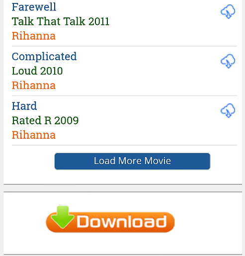
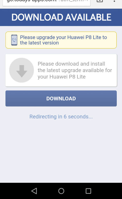
For example, we’ve searched for a website to download Rihanna songs. And this is what appeared:
banner 19

When clicking the DOWNLOAD banner-button, we were redirected here:

banner 20

In the end, a misleading banner redirects to a misleading pre-lander.

Great, right?

Do we really wanna click any further?

Hell no!

These aren’t the Rihanna’s song we wanted, and more than that, we’ll remember there’s such a download button and will ignore it even if there’s a real offer behind.

This is when the Publisher (owner of the webpage) is involved because this rotten practice will scare users away!

Another type of blind lead can be addressed when using a banner that redirects the user to a signup form, where the form doesn’t provide any info about the offer’s content the users are signing up for.

This basically means you’re leading your user into a dark zone where they don’t know what kind of content they’ll get.

This can be harmful for you because you can lose conversions due to a lack of info or misinformation.

By using blind leading, you can also notice that user’s expectations from the Call-to-Action of the banner end up being thwarted since they’re directed to something completely different.

It’s a case of expectation management, besides the obvious problem you can have with your affiliate program.

Never forget that it’s your reputation and image that can be destroyed forever.

As a result, you can be punished by the network, which starts losing trust in you as a publisher.

6. Use of images with sexual content that don’t follow country/publisher rules

The affiliate marketing world is aware that the adult segment is very popular and commonly associated with a great amount of leads and revenues.

However, when promoting this type of offers, you should pay attention to the country and the carrier permission regarding the category of sexual content you can use on your banner to promote the offer.

Yes, it’s true! There are rules regarding the type of images you can use and these depend on the country you wanna promote on!

There are four categories of adult content.

This means the images you can use on your banners should match the correspondent country category.

  1. Glamour: images with sexy girls that always have clothes on. No touching or nudity allowed
  2. Sexy: images with girls showcasing sexy poses – bikini or lingerie
  3. Topless: images with girls doing sexy poses. Showing breasts and self-touching is allowed
  4. Hardcore: images with explicit, straight sex (no minors, brutality or animals allowed)

In case you’re promoting adult content using banners, please be sure that you’re following the rules of the country where you’re promoting.

Otherwise, you’ll most probably have problems.

7. Use of images with pedophilia, Zoophilia or aggressive content

This is totally forbidden.

It’s one of the most basic affiliate marketing rules and can therefore be found in any Terms and Conditions when you sign up for a program.

If you use this type of banners, there’ll be no excuses or forgiveness from the affiliate network and advertiser, we can assure you!

All that money, effort, and time you’ve put into your campaign is gonna be wasted as you won’t receive none of the money generated from those leads.

What else is gonna happen to your sorry self?

You’ll be banned from the affiliate program!

Conclusion – What You’ve Gotta Remember!

Never forget: the trick for you to build a trustworthy, lasting, and profitable business relationship is to be as honest as possible.

You need to get quality leads that’ll spend money on your offers.

To do it, you’ll need to use banners that have a good performance, follow the promotional rules, and are an accurate preview of the offer’s content.

In the end, you’ve gotta be totally honest with the audience and use banners and a call to action that match the offer’s content.

Moreover, it’s important to analyze all the aspects, including your target group, considering their interests, so that you can deliver quality content.

If a visitor signs up for the offer and gets what the banner has promised, it’s possible that they’ll continue to subscribe in the future.

On the other hand, if your banner promises something totally different from the actual offer, it’s most likely that you’ll lose that potential user.

Got any doubts about the banner you wanna use?

You can always get in touch with your Account Manager, or contact the experts of your affiliate network’s Support Team.

They are there for a reason:

To help you when you have questions assaulting your brain and making you feel insane!

We sure hope you found this article useful!

We know it’s gonna help you avoid some mistakes.

On Mobidea, you know we’ve always got your back!

Our mission is to guide you and provide all the necessary info for your campaign to be a marketing success with zero risks!

Cheers from these two queens!

Feel like asking questions about misleading banners?

Us girls are here for you!

Ask those questions now!

See Also:

Advertisement