A Guide on How to Create Converting Affiliate Landing Pages
Last updated on October 13, 2022 by Nelson Nascimento 17 min readYou are currently in the "Landing Pages" - Learning paths
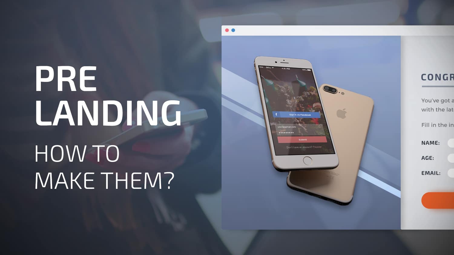
Pre-Landers: Main Web Concepts Explained
5 min read
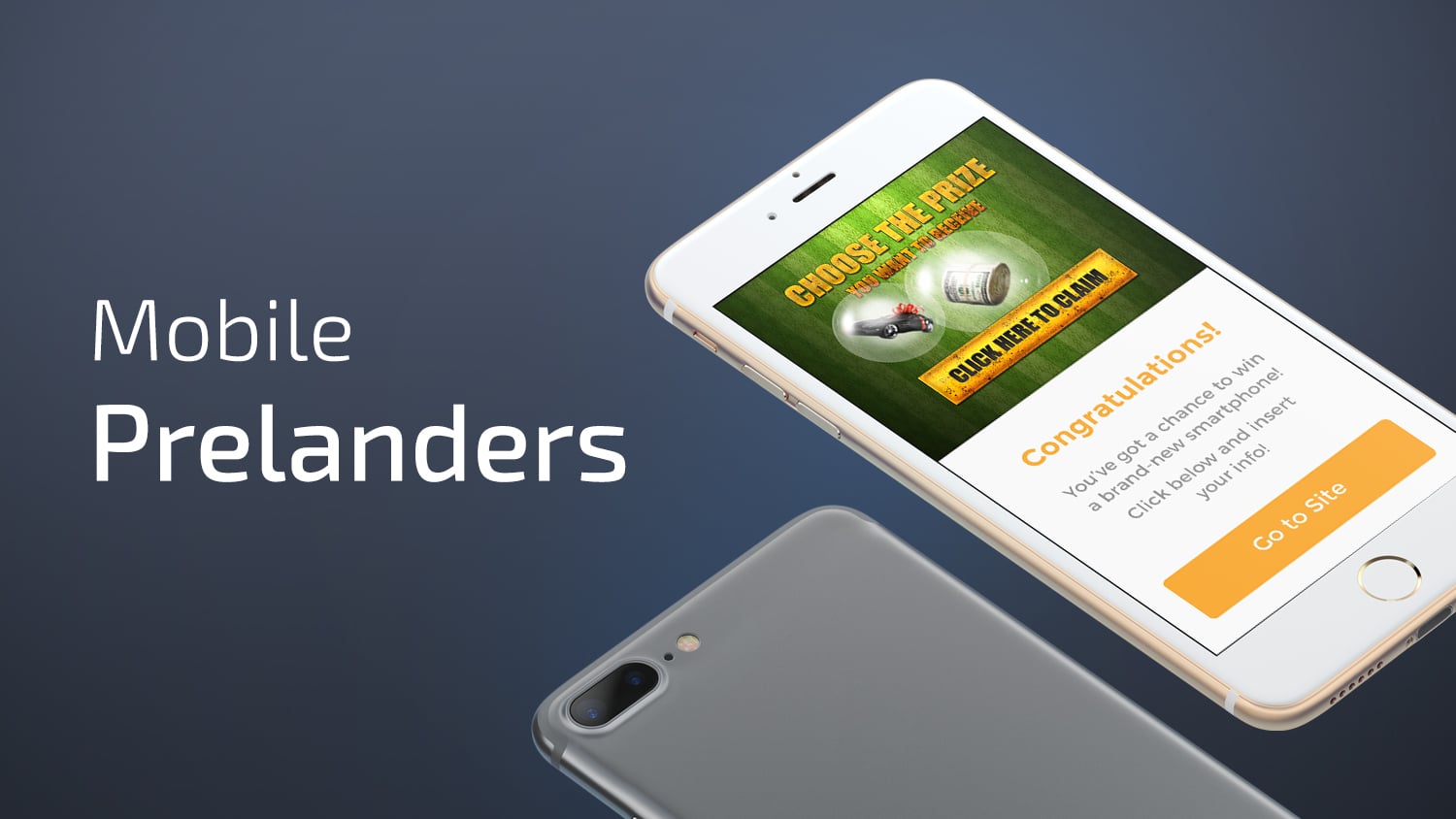
5 Most Common Mobile Pre-Landers That Convert
10 min read
How to Quickly Set Up CDN, Hosting and Domain
5 min read
A Guide on How to Create Converting Affiliate Landing Pages
17 min read
Best Ad Spy Tools for Digital Marketers
18 min read

AdPlexity Review: Guide + Lifetime Discount
8 min read
PureLander Review: Craft Affiliate Landing Pages in Just a Few Clicks
14 min read
Table of Contents
ToggleIntroduction
We’ve all been there:
We go to one of these industry forums, check some threads, and then we see it:
A reference to landing pages.
But, wait!
What is a landing page?
How is it used in affiliate marketing?
What types of landing pages can media buying pros play with to increase conversions?
What are the best landing page templates to explore?
Wanna find out?
Want some free landing page templates to go for?
Let’s read up, then!
What is a Landing Page?
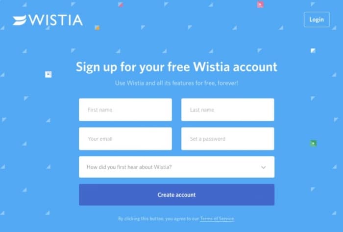
Landing pages are custom pages which have been created bearing the specific interests of a particular target visitor in mind.
By creating a specific landing page, you can effectively tailor the customer’s experience, providing eager users the exact info they need to check.
Source: Wistia
With a landing page, the process of directing the user and make them perform a particular action also gets simplified.
This will ultimately allow you to increase your database or mailing list and get more users going to the right place.
This also means you’ll get a higher number of conversions, and that you help improve the user’s overall experience.
Moreover, since you get the right users to fully understand what they need to do to reach the offer, you’ll effectively reduce costs to boot.
Why?
By getting more users to check your landing page, reach the offer, and convert, you’ll be spending less money to get equal numbers of users coming your way, and buying your product.
Amazing, ain’t it?
That’s what I call a landing page definition!
Types of Landing Page
Now that I was able to define landing page, it’s time to understand which are the high converting landing pages you need to know.
Ready?
Let’s go!
There are two types of landing pages every marketer should know:
- Lead Generation Landing Pages
- Pre-Landers
What is a Lead Generation Landing Page?
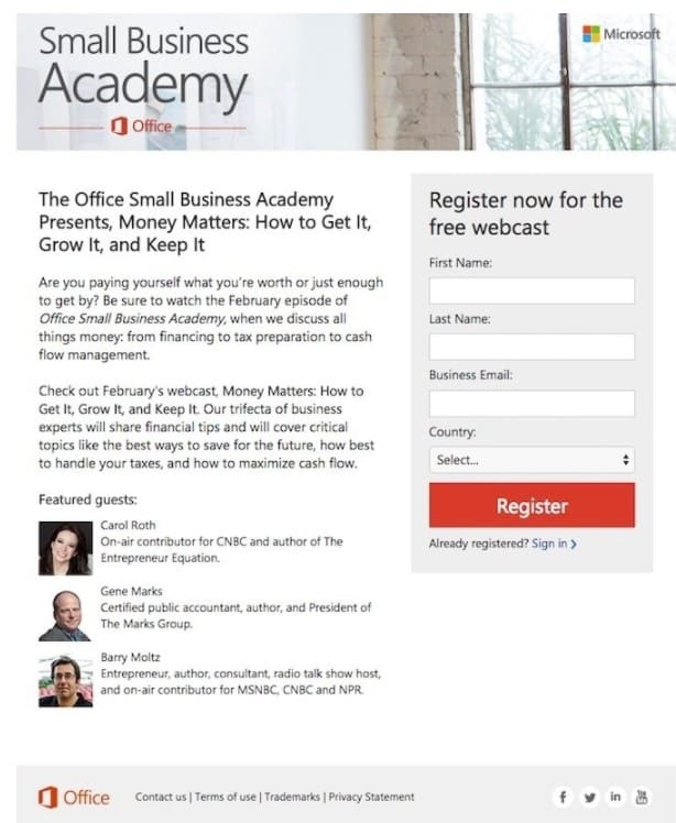
A lead generation landing page is designed with a pretty specific purpose:
To get personal info about a certain client/prospect.
What type of info?
It can be the user’s email address, a phone number, the user’s name, the size of their enterprise, etc.
Source: Microsoft Small Business Academy
What are the creators of lead generation landing pages searching for, you ask?
They’re looking for leads.
Without these aforementioned leads, you’ll never be able to generate viable customers:
People who spend money on the products you want them to spend money on!
There are many uses for these types of landing pages.
Usually, people resort to lead gen landing pages when a greater product or service is getting sold.
Learn More: The Perfect Lead Generation Marketing Campaign [INFOGRAPHIC]
What is a Pre-Lander?
What the heck is a pre-lander?
A lander before the lander?
That’s right!
A pre-lander is a page which appears right before an actual offer.
What is the Goal of a Pre-Lander?
Generally, the objective of a pre-lander is to act as a warm up for the visitor.
Users check the pre-landing page, and they get a sense of what the actual offer is gonna be all about.
A pre-landing page has a clear Call-to-Action with no distractions that could confuse potential users, leading them to convert.
By the time they effectively click through, users have already become acquainted with the offer.
Which means what?
They’ll be more likely to convert, that’s what it means!
How to Create a Landing Page
Now that you know what is a Landing Page and how to distinguish the two popular types of landers, it’s time for you to learn how to actually go about creating a landing page.
Am I right?
Hell, yeah!
Let’s go!
Time to start making your landing pages become a reality.
This means I’m gonna skip the more advanced lesson and go straight to the best part:
Providing you guys with landing page tools you can use to start doing your thing right quick!
Tools to Create Landing Pages
Need a landing page generator?
Wait for it!
There are many different tools you can access to become able to create a landing page.
List of the best landing page creators:
- Landingi
- PureLander (Landing page tool for affiliate and CPA Marketing)
- LanderLab
- Thrive Themes (Recommended for WordPress)
- Instapage
- Unbounce
- Leadpages
Any of these tools can yield amazing results.
See Also:
I personally recommend you visit Landingi, PureLander and Thrive to learn how to make a landing page that’s gonna give you what you need.
Yes, indeed!
Even so, more than knowing which tools to use, you should definitely try to understand the purpose of a landing page.
What’s the aim?
What are you going for?
Depending on your goals, you’ll come across different landing page tools.
And more importantly:
You’re not a complete newbie and even know a little something of HTML/CSS?
Then you’ll probably be able to get most landing pages working fine.
That’s right!
You can have a sweet HTML landing page!
What to do?
Go track your competitors and check their code to see how it’s done!
That’s how you get to create great landing pages.
This is the website landing page course you need.
Just click “View Source” on your browser and spy like a maniac.
Hire an Experienced Professional
You may be thinking – “ok, but I don’t have the necessary skills to create a great landing page. Can I hire someone to do it for me?”
No problem!
You can hire good professionals for a few bucks to do the work for you on freelancer platforms.
To make the work even easier for you, here’s a list of the best landing page design services on Fiverr, one of the biggest freelancer platforms worldwide.
Related Content: 25+ Best Affiliate Marketing WordPress Themes You Should Know
Now you ask – “what type of landing page should I create?”
There’s a great way to do it: spy on your competitors!
How?
You can use AdPlexity (25% lifetime discount) or AdPlexity Adult, which is the recommended ad spy tool from Mobidea Academy.
I’ll go deeper about spying in this article.
What is Your Goal?
Remember when I mentioned purpose?
That’s a crucial aspect to ponder upon when creating a web design landing page.
You probably wanna convert users like a pro.
Let’s think for a moment.
What to do?
First, before starting the process of landing page design, you must understand who your customer is.
Second, you’ve gotta make sure you know what your users are supposed to do while on the landing page.
Third, it’s time to create a page that galvanizes users, making sure they’re so excited they actually convert.
What do you want your users to do?
Let’s pretend you want them to give you their email.
That’s the info you’re looking for, because you happen to be the kind of affiliate marketer who understands the importance of an awesome user database.
What will you give in return?
Let’s say that your users get a FREE Guide straight outta Mobidea Academy.
In return, they’ll give you the info you need.
But what’s the problem?
Simple:
In order for the user to actually choose to divulge their info to acquire your FREE Guide, you must remove any sort of resistance users may have regarding what they need to give up to get the product.
People are careful about sensitive info.
They’re afraid, reticent, and don’t wanna give their personal info away.
What to do?
In order to remove the fear of some thoughtless crime that’s going through your audience’s collective brain, you must first understand who these people are, what they’re looking for, and why do they want your Affiliate Guide in the first place.
This is how you create the best converting landing pages!
Get it?
No?
No worries!
I’m gonna go over it into detail right now so you can get to understand how to create top landing pages.
Affiliate Landing Page: How to Identify Your Audience
We all know everyone is a special little gem.
Everyone is different.
In this industry, we must not only know this but adapt our landing page strategy accordingly.
Success is gonna come your way if and when you effectively know your audience’s inner needs and desperate desires.
What do they really want?
Once you find that out, after an intensive study and analysis of your audience, you’ll become able to better cater a simple landing page that answers the user’s needs.
People wanna be happy.
They don’t have something.
They want what they don’t have.
Find out what your audience are in lack of, understand how to create an appealing landing page after a thorough analysis of your market, give your audience exactly what they need, and I’m sure you’ll get those awesome conversions.
Did you study your audience to be able to create effective landing pages?
Do you know the numbers, stats, and have all the wealth of data needed to target your campaign to those specific customers who shall definitely convert?
Have you made your visitors get a glimpse of how awesomely fantastic their life is gonna be once they get to your offer?
Then you’ll be getting more conversions than it’s even possible.
Want more info on buyer personas so that you can identify your target audience like a pro?
Check this post right now!
You’ll get to see what must be done for you to be proud of your awesome landing pages!
The Secret Sauce: Copy
One of the most crucial factors that’ll help you come up with highly creative and high-converting landing pages is the power of your copy.
Try to learn from different landing page copy courses.
You really need to hone your writing skills, crafting compelling yet decisively to-the-point sentences that galvanize users, make them click, and get you some sweet conversions.
You must understand the importance of writing persuasive sentences that use the immense power of both emotional force and logical reasoning to get users to click!
Moreover, you should definitely learn how to use proven landing page copy techniques that help you keep your copy goals focused on what matters most:
The specific desires and yearnings of your target audience!
Feeling iffy about this particular aspect of landing page creation?
Check this article and get some much needed landing page writing tips!
How to Analyze Traffic Coming from a Landing Page
You wanted to create landing pages.
Done.
You’ve got your landing page and you’re the coolest landing page designer in town.
You’ve used one of the free tools I’ve mentioned.
You’ve learned how to have a complete grasp of your audience, what they want, how to build the perfect landing page that gets conversions, etc.
You have copy tricks and know everything you need to succeed!
But how to know if the deal is paying up?
How to measure the success of a landing page in affiliate marketing?
You take a look at three cool metrics that you should ALWAYS bear in mind when creating a landing page:
- Time on Page
- Bounce Rate
- Conversion Rate
Time on Page
You probably know that Google Analytics can only record the time spent on a page if the user happens to move on to another page on the same specific website.
Meaning?
If a visitor reaches your landing page, stays there for a while, actually completes a desired goal on the said page, and then leaves the site, Google Analytics will actually record that particular time spent on page as a disappointing 0:00.
This means you can’t trust Google Analytics when it comes to ascertaining the Time on Page.
Which tool can you trust to know this important metric?
Google’s Event Tracking API!
Just insert the “Track Event” JavaScript code.
This way, you’ll be able to record when a visitor is on a page, since the code triggers every 10 seconds.
What does this mean?
Instead of having Google Analytics give you an inaccurate idea of your landing page’s Time on Page, you’ll get a super accurate result that measures engagement like nothing else.
Bounce Rate
Let’s say a huge number of humans visit your landing page.
That’s great!
Even so, let’s pretend that 90% of them visit and BOUNCE right away, frightened to the core.
Bad news, am I right?
Indeed!
Bounce Rate is a spectacularly important metric you’d be a fool to overlook.
It allows you to understand that your landing page – which was supposed to take the audience’s desires into account and also be super appealing – is not that appealing and therefore completely fails to do what it was meant to.
Wrong!
Here’s what you don’t know:
Sometimes, the Bounce Rate can be inaccurate.
Why?
Because it doesn’t truly distinguish a user who came to the page and bounced right away from that other user who encountered the landing page, stayed for a while, analyzed the proposition, and left.
If a user comes to the landing page and spends several minutes analyzing, then we have a great sign.
Your landing page may not be the bee’s knees but it somehow managed to hold the user’s attention for a while.
How to make sure you get an accurate Bounce Rate?
One that separates the pogo sticker from the guy who comes in and stays for a while?
You determine a minimum amount, that’s how.
It’s a minimum number of minutes a specific user spends trapped in your landing page before actually converting.
Let’s say that most of your conversions happen only three and a half minutes after the user gets to your landing page.
These visits – which would have been considered bounces and would have negatively affected your Bounce Rate – will cease to be.
Want a special trick to help you calibrate this metric for you to get a super accurate Bounce Rate that clearly helps you understand how you’re doing in landing page land?
Are you all set up and ready to party on Google Analytics?
There’s a tweak you can efficiently insert on your Analytics code.
This tweak will actually trigger an event after the user has indeed spent a determined number of minutes on your landing page.
That’s right!
Clears things up for you, right?
You’re on the path to create the best landing page so keep reading!
Conversion Rate
This is the gold medal!
It’s the most important metric when it comes to landing pages.
No doubt about it, mister!
Have a great conversion rate?
Then you’ve been able to create landing page history!
But what can mess up your conversion rate data?
The fact that – on Google Analytics – the conversion rate is actually calculated not based on the number of unique visitors but instead based on the number of visits.
Why do I think the conversion rate should be calculated based on the number of unique visitors, you ask?
Because not every visit that’s gonna come to your landing page is gonna develop into a conversion.
That’s right:
The customer’s decision may come about only after the person comes to your page after a few more visits.
Customers look around, study, search and understand the pros and cons of other offers before they pick your offer.
This means?
The user can return to your landing page several times before actually becoming a fruitful conversion.
That’s why using unique visitors will actually give you a more accurate notion of the user’s purchasing journey.
As a result, you get to tweak your strategy and become able to better measure the success of your landing page.
Now that’s data taken to a whole new level, ain’t it?
That’s right!
It’s landing page optimization turned real!
Spy or Die
I’ve already mentioned this part briefly.
Even so, I’ll devote a whole heading to it.
Either you spy or you get killed.
Who are your competitors?
Find them.
Now go through their funnels and understand their message, the placement of several trust factors, their whole style, and even how they go about Calls-to-Action.
What info do they get from the user?
Do they use cool dynamic call-outs in an attempt to galvanize the user?
What are the colors they’re going for?
Do they have what’s known as a lead magnet?
Got the info?
Now it’s A/B Testing time!
Check all the aspects I mentioned and drink your competitors’ creative juices.
A/B test!
Time to split test 4 or 5 styles of different landing pages.
This is how you get to the best-performing type of landing page!
As I already suggested above, I recommend you to use AdPlexity (25% lifetime discount) or AdPlexity Adult to do it like a pro!
Learn more: AdPlexity: The Definitive Guide
Speed Up Your Landing Pages
Feel like the speed of your landing pages isn’t that relevant?
Wrong!
Speed is crucial!
This world is filled with impatient users who have a whole lotta different landing pages to check besides yours.
This means people want your landing page to be as fast as possible.
In fact, a delay of only one second can mean 11% fewer page views, a loss of 7% when it comes to conversions, and a decrease of 16% in user satisfaction.
What?
Don’t know what you must do to ensure that speed is Nascar-fast?
I’ve got you covered!
Test Your Site Speed
First, before even starting to worry about the speed of your landing pages, you should visit Google PageSpeed Insights, Pingdom, or GT Metrix.
These platforms will effectively allow you to test the speed of your landing page!
Go for it!
Use a Great Hosting Service
Number two little something you can do?
Using a great hosting service like Bluehost or Hostgator is something that can upgrade your whole experience.
Avoid using solutions which go for shared server space.
This means you’ll probably end up having to share server space with other cool customers, which will invariably drag your performance.
Use a Content Delivery Network (CDN)
Indeed!
You should use a CDN to deliver images.
This will allow you to make sure the effort required to actually deliver content from the server to a user’s browser is gonna be optimized.
Optimize Images
Resizing your images is crucial in your landing page experience.
Though often neglected, this is a fundamental step.
Why?
Because this trick really speeds up your whole site.
There are some free image compressing tools out there such as Compressor.io or TinyJPG.
If you’re a WordPress user, you can go for WP Smush or EWWW.
You can also avoid using PNG images, since they occupy more of that sweet space than JPG images.
Minimize Redirects
Redirects, especially the 301 redirect, are one of those basic, standard SEO practices.
Why do people use a 301 redirect?
To inform visitors and search engines that a page has moved its location on a permanent basis.
As sites tend to shift, evolve and change over time, this practice has become the norm, helping you to also cut broken links or those messy 404 errors.
Here’s the deal:
You need you have a low number of redirects, because this will positively impact your page’s loading speed.
Is there a perfect number of redirects?
Even though Google tends to be a bit vague about this, the tech giant suggests that you either minimize redirects or eliminate a bunch of them.
The most popular tool to check the redirects contained on a website is Screaming Frog.
Enable GZIP Compression
This has to do with content encoding.
It’s about minimizing server requests made by your specific browser.
This means you can get to reduce the size of your files, thus enabling much quicker loading times.
Enable Browser Caching
When you happen to visit a given website, the page’s different elements will be stored on your hard drive in a cache, or what’s also known as temporary storage.
This means that – the next time you visit the site – the browser can effectively load the page without the need to send a whole other HTTP request to the server.
HTML & CSS – Reducing Time
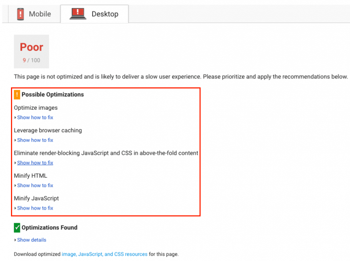
Minimizing both CSS and HTML will allow you to package and also deliver the data of a page as fast as technologically possible.
Don’t know how to go about it?
Insert your URL on Google PageSpeed Insights and follow the suggested guidelines!
Don’t Use Too Many Plugins
WordPress plugins!
Where would any of us be without these gems?
It seems harsh to say we need to divest ourselves of these handy little helpers but it must be done.
Try to do a complete overhaul and make a decision:
Important plugins stay, irrelevant plugins have gotta go.
Optimize CSS Delivery
What’s CSS?
It basically holds the requirements of style of a given page.
Normally, websites will access this info either through an external file which will actually load before your page has effectively rendered, or inline, which means it’s efficiently inserted in the HTML document.
Which style should you go for?
External style!
Why?
It not only reduces the size of your code but also creates a lower number of code duplications.
Landing Page Examples
Ready to check some awesome examples of landing pages?
The people who’ve created them were able to understand some of the points I’ve explained to you above.
Let’s check these examples of landing pages!
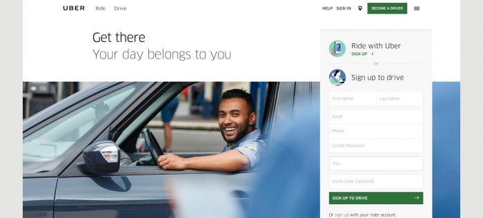
This landing page was created by Uber.
What’s great about it?
Its simplicity.
Notice how you can easily get to understand the actions you must undertake.
You can either register to be a driver or a rider.
Easy, fast, and to-the-point!
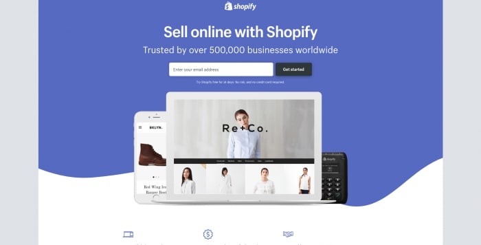
Shopify never plays around.
Check how these guys start by establishing their street cred and authority:
They tell you they’re trusted by half a million businesses all over God’s green earth.
They’re also able to quickly let you know where to insert your email!
Simple, right?
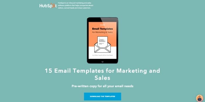
HubSpot has some master landing page creators, am I right?
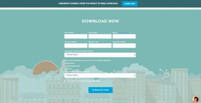
The CTA is straight-to-the-point and, after you click it, you’ll find the following image:
What happens if the user fails to click the CTA?
When they scroll down, a CTA button appears at the top!
It’s another CTA just to make sure you click!
Awesome and efficient!
Conclusion
“What are landing pages?”
Now you know!
You got the tools to create a hyper responsive landing page, becoming able to come up with appealing landing page designs every single day.
I taught you how to create the best landing pages for WordPress and also how to go for custom landing pages like a pro.
You know the different types of landing pages.
You know your goal and have studied your audience.
You even know how to check the right metrics to analyze your traffic.
You’ve spied and performed split testing.
Now, what?
Explore the tools I gave you, launch your landing page, understand how to fully grasp the metrics found on Google Analytics and Google’s Event Tracking API, spy on your competitors, split test, read about landing page best practices.
Ready to start your affiliate journey?
Go for it!
Sign up for Mobidea here!
We’re gonna help you succeed!

Nelson was still a kid when he joined Mobidea in 2013 as a Media Buyer. After four years of pure dedication and gallons of coffee, he is now Affiliates Director. He manages an amazing team of Account Managers, you know, those guys that will help you make more money. His main goal is to give all the tools and data to his team so they can help you even better and provide the best service possible to all Mobidea affiliates. Outside of work, he is a normal bloke: he likes to play football, visit interesting places, have some drinks (alcohol-free always, he swears) with his friends and watch/read inspirational stuff about management. What else does he like? Smart people, a good cup of tea and hip hop music. He also enjoys spending time in his small village, where he can finally provide his pacemaker some earned moments of quiet peace.

